
It’s A Date
Our data analytics team at Starr & Associates often partners with operations and our six sigma engineers to drive process improvements by using various exploratory, statistically descriptive, or predictive analyses to identify opportunity. We also partner with them over the course of the initiative to track progress through interactive dashboards. In all these efforts, the definition of the metrics and KPIs to be tracked are a focal point, and rightly so, since having the right metrics is critical to success and value creation. However, by the nature of operations, there is always another dimension in the background, the element of time. The cadence of the time dimension is so natural to the business that it seems not to require much discussion, but the way it is handled can have implications on the reported results as well as potentially creating some tricky predicaments when trying to meet conflicting stakeholder needs.
Our time and motion analyses deal with time in minutes and seconds, but when working with operational results overall, the time dimension is most often represented as a date. Usually, early in our discussions, we hear about the monthly targets for the metrics from either the operations or finance teams. Monthly targets are the standard because they have many benefits. Since they are explicitly named time periods (i.e. December), they are relatively easy to manage and there is no ambiguity in defining comparative periods such as a prior month or prior year. The same holds for any collection of months, i.e. quarterly or yearly. Life is good in the world of monthly reporting.
While monthly reporting may work for budget comparisons or reviewing big picture progress at an executive level, the operations improvement teams need more frequent feedback. One approach is to present a projection of the full month:
Full Month Projection = MTD Actuals + Remaining Forecast
The forecasted component can be a simple straight line estimation based on the actuals:
Remaining Forecast = MTD Actuals / Actual Days * Remaining Days
It can also be as complicated as you would like, incorporating multivariate regressions or other predictive approaches to most accurately project the remainder of the month.
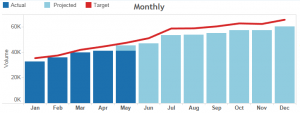
Regardless, the main point here is that we would present a monthly value that could be compared to other months. Problem solved, right? Well, no. This may work in some cases, but the monthly projections can hide trends that should trigger action. The other downside is more fundamental to monthly reporting. While easy to report and compare, the actual time incorporated in a month is variable by the number of days in the month. Can we compare 31 days in October to 30 days in November? That’s a 1/30 = 3.33% variation in the time represented. In addition, many operations expect cyclic variations by the day of the week (i.e. Wednesday vs Sunday) and the number of each day of the week is also variable in a calendar month. This will not only effect comparisons to a prior month, but also to the same month in the prior year since the months will start and end on different days of the week. Our beautiful monthly reporting is ruined!
Obviously, these issues have been around for a while. In my work in the media industry, we worked with the standardized broadcast calendar used for planning and purchasing of television advertisements. This calendar ensures that each month contains only full weeks that start on Monday and end on Sunday, but it still allows for either four or five weeks per month.
Fortunately, flexible data tools such as Tableau allow us to design multiple visualizations based on a common data set and therefore we can take different approaches to different stakeholders and still leverage automated refreshes. One size does not need to fit all.
For our operations team, weekly reporting has often been the optimal answer. We address a number of the inherent variations mentioned above because each week is the same duration containing one of each weekday. Comparison to prior week is still well defined, however, the comparison week in a prior year is not as straightforward. The reason is that using a given Month/Day and changing the Year will result in a different day of the week.
One system designed to address this is the ISO standard for week numbers. This is another Monday through Sunday standard and the week is assigned to the year that has the majority of the days (at least 4 days). The first week of the year is the one that includes the year’s first Thursday. This calculation is generally built into our tools and easily accessible. Using week numbers on a year over year trend chart may give us something like this:
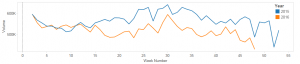
The comparison across years and the trends are nicely visualized. But, what happened around week 30 in 2016? And when exactly is week 30? It is not intuitive for the business to relate these trends to their knowledge of events that occurred.
With a little work, we can fix this. First, given any date, we can find the date of the Monday for that week. For example, in Tableau, we can calculate [MONDAY DATE] as:
DATETRUNC(‘week‘,[DATE],’ Monday’)
And we might get to the comparison week in the next year by adding 52 weeks:
DATEADD(‘week’,52,[MONDAY DATE])
While the syntax is not important, the outcome is that we can align these weekly trend lines and show a date dimension on the x-axis.
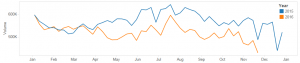
Here we can easily see that there was a peak in July of 2016 and the business experts can relate that to what they know was going on at that time to explore potential causes.
In the end, the treatment of dates will always depend on a client’s specific business logic, but understanding the issues and experience in working through them will help guide the team to success.